Entry 8
Date of Entry: February 24, 2018
Section: Taking Action
ATLs: I am addressing creative thinking by showing the creative choices I made to make a professional-looking YouTube channel and website, and explaining how this was a result of experimenting with ideas, as well as drawing inspiration from sources found during the Investigation.
Subject: This entry is about how I changed the look of my YouTube channel and website to make it more aesthetically pleasing, engaging, and professional-looking for viewers.
Content: For my YouTube channel to appeal viewers, it needed to have a professional-looking set-up. The profile picture, home page, and channel banner all needed to be able to tell something about my channel very quickly. At the same time, they needed to reflect the kind of look seen on other YouTube channels similar to mine.
My first step to making my channel’s set up was inspecting the set up of the channels I used during the Investigation section of the Personal Project. A YouTube channel that was prevalent in my research was Casey Neistat’s. His concept of making vlogs, mini-documentaries, and also the occasional tutorial made his channel a perfect place to draw inspiration because my own concept is so identical to his. So when I started to create my channel, I inspected his channel and adapted some of the aspects that stuck out the most to me. For example, my profile picture is similar to his. Something as small as a profile picture can be very significant on a YouTube channel, because a viewer’s first look of the channel is the profile picture. Another notable adaption from Neistat’s channel was his featured video on the home page. The featured video for his channel is an exclusive video from about a year ago, which he chose to feature because he thinks it is his best video ever. My process of selecting a featured video was the same; I chose to put the mini-documentary because I feel the most proud of it.
The last important part of my channel’s visual set up was the banner (also known as channel art). For this, I drew inspiration from Cody Miller’s YouTube channel, since his banner had an appealing background and gave a quick idea of what his channel was about. The format for my banner is the same, as it has a simple background and a text box that summarizes the content of my channel.

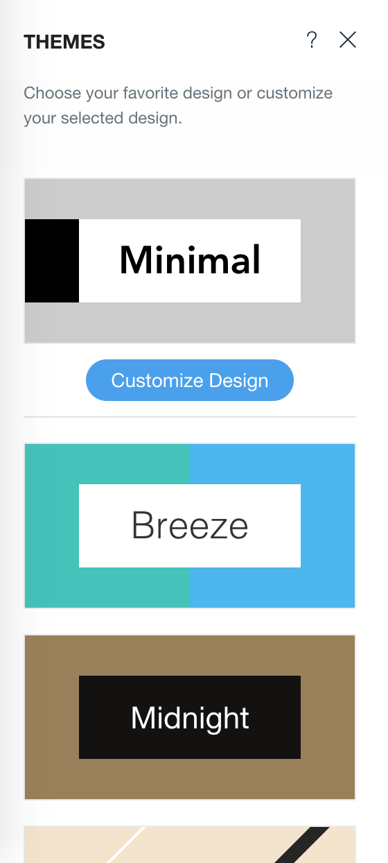
Ensuring that my website looked professional and appealing required a different procedure than my YouTube channel. While I based the look of my YouTube channel on other famous YouTuber, I did not have any inspiration for the set-up of my website. Instead I used the interactive website builder provided by Wix.com to improve the look of my website. One of the first steps I had to take to create my website was to select a specific theme. This was my first time using Wix.com, and the theme selection tool definitely was a lot better than other website builder like Weebly.com. The theme selection on Wix.com is purposefully rigid, and prevent the creator from making unnecessary color changes or designs changes to the website. When websites have too many colors, fonts, or page designs, it loses a homogenous look. A website needs to be simple and easy to navigate, but also keep the viewer interested. I specifically chose the theme called, ‘Minimal’. This theme managed to provide a professional look because had a neat and clean white, black, and gray colorway, as well as simple page designs and legible fonts.
|
My chosen theme called "Minimal" was simple, but straightforward, neat, and looked sharp. |
Outside of the theme selection, there were also other less recognizable tools provided by Wix.com to make a more interactive and appealing website. For instance, a simple addition that was very useful was the ability to embed videos on the website. Since I wanted my website and channel to accompany each other, I needed to be able to somehow incorporate my videos into the website. Being able to embed videos let me put videos like my tutorials in the “Physical Activity” section of the website, where the video would be relevant to the topic. Sometimes I chose not to embed videos on my website though. Instead, I simply put a linked button with a command like ‘Watch my vlogs’, so that viewers could click on the button to reach the page where they could watch my vlogs. The button option was perfect for the page dedicated to my mini-cookbook, as I was able to link the button to a document that could be used to print the recipe out. Thus, Wix’s interactive website builder, which pointed out fine details that usually go unnoticed made sure that I produced a professional-looking website.

Embedding Videos |
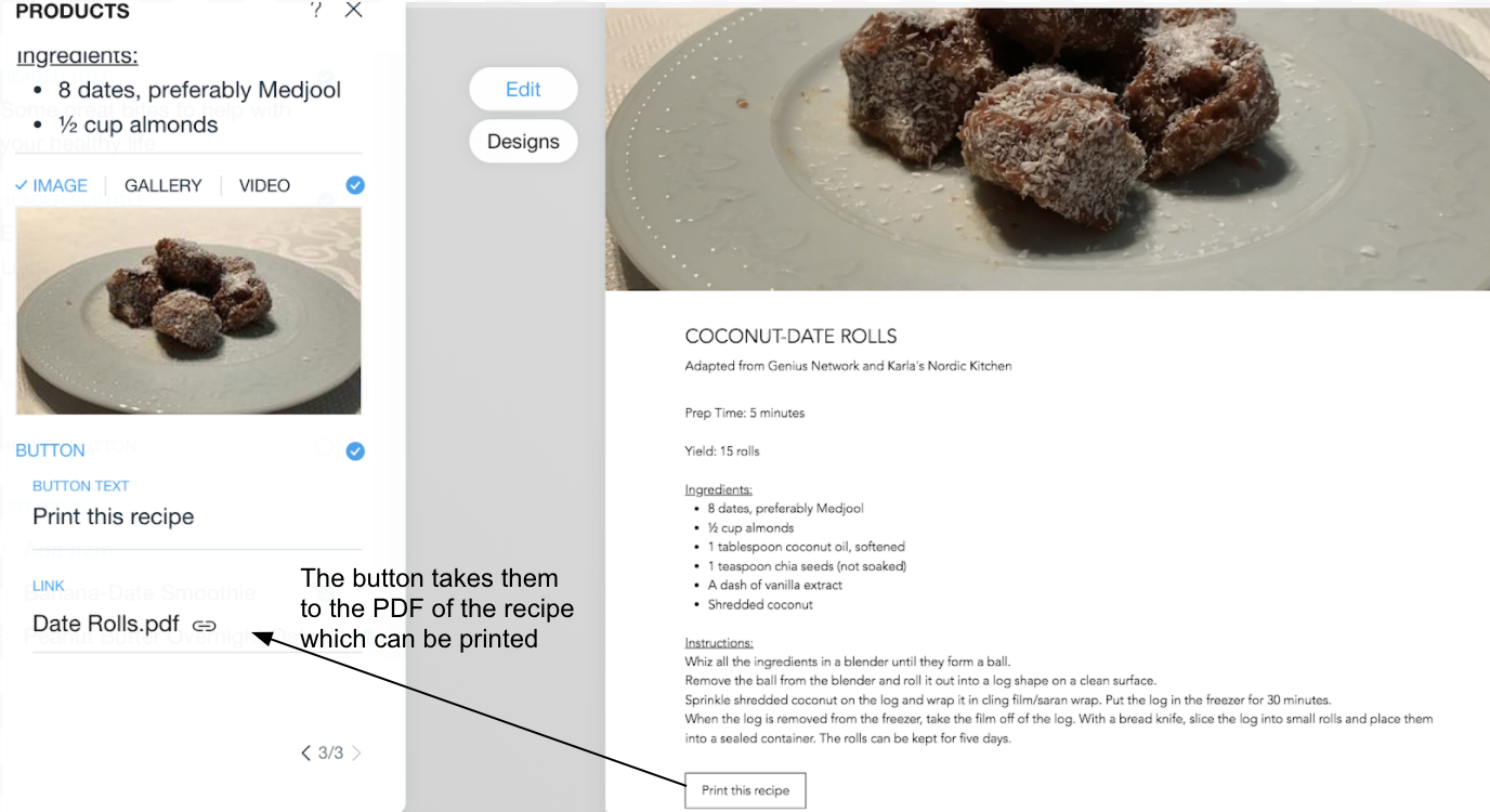
Buttons with Links |
